Materials and Scientific Analysis
What is XRF?
Victor F. Hanson, a retired DuPont physicist, established Winterthur’s Scientific Research and Analysis Laboratory in 1969 with the development of the first x-ray fluorescence (XRF) spectrometer designed specifically for the nondestructive analysis of museum objects. XRF is now one of the most valuable techniques used by museum scientists around the world since it does not require a sample; no material is removed and there is no damage to the artwork.
With x-ray fluorescence analysis, a beam of x-rays is aimed at an area of an object such as, for example, the red colorant on a print. The high energy of the x-ray beam excites the elements in the red colorant, causing them to emit secondary, or fluorescent, x-rays. The energies of these fluorescent x-rays coming from the red colorant are characteristic of the elements present in the pigment, and so can be used to identify them. As a result, x-ray fluorescence data can be used to distinguish between a mercury-based red pigment and a cadmium-based red pigment, for example. The ability to distinguish between mercury- and cadmium-based reds can be critically important to determine the 20th-century application of colorants to 19th century prints since cadmium-based red pigments were not commercially introduced until 1907.
XRF of Currier & Ives Prints in the Winterthur Collection
Using x-ray fluorescence (XRF) spectroscopy, Winterthur scientists identified the inorganic pigments below, such as chrome yellow, zinc white and emerald green, all recent inventions in the opening decades of the 19th century. Organic pigments such as gamboge and indigo were identified with microscopy. Fanny Palmer’s Quail Shooting includes viridian—an expensive, vibrant green synthetic pigment that was widely available in its more transparent, hydrated form only after 1850. (A Winsor & Newton catalogue from 1850 listed watercolor cakes of viridian—“chromium green oxide”— in its third pricing tier: three shillings versus one or two for materials in the lower tiers.) An alternative to viridian, the common, inexpensive mixture of Prussian blue and the organic yellow pigment gamboge, was also found in a number of Palmer’s landscapes, as were the problematic pigments verdigris (which is unstable) and emerald green (which is toxic). It is impossible to know why viridian was used in Palmer’s print, but apart from its high cost, it was ideal: singularly transparent, it could add color without obscuring Palmer’s draftsmanship and design.
Quail Shooting
Frances B. Palmer, artist and lithographer
Nathaniel Currier, publisher
New York, New York; 1852
Hand-colored lithograph
Bequest of C. Porter Schutt 2000.19.126
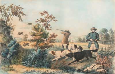
Viridian
Iron Oxide
The Infant Brood
Arthur F. Tait, artist
Currier & Ives, lithographers and publishers
New York, New York; undated, printed about 1872
Hand-colored lithograph
Bequest of C. Porter Schutt 2000.19.66
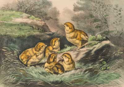
Gamboge
Verditer
American Speckled Brook Trout
Arthur F. Tait, artist
Charles Parsons, lithographer
Currier & Ives, publishers
New York, New York; 1864
Chromolithograph
Bequest of C. Porter Schutt 2000.19.19
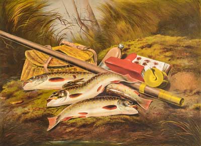
Chrome Yellow
The Home of the Deer
Arthur F. Tait, artist
Charles Parsons, lithographer
Currier & Ives, publishers
New York, New York; 1862
Hand-colored lithograph
Bequest of C. Porter Schutt 2000.19.18
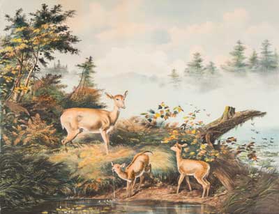
Zinc White
Chrome Yellow
American Country Life. October Afternoon
Frances B. Palmer, artist
Nathaniel Currier, lithographer and publisher
New York, New York; 1855
Hand-colored lithograph
Bequest of C. Porter Schutt 2000.19.163
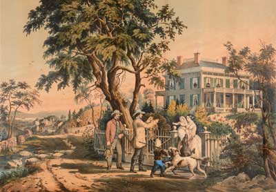
Emerald Green
Vermilion
Prussian Blue
Red Lead
Indigo
Future Work
Are there palette variations between copies of Currier & Ives large folios? Are there differences in the palettes of the firm’s staff colorists working on the small folios versus the professional artists contracted to color the larger folios? Future research can help answer these questions and contribute to a better understanding of the condition of production of the publishers' high end lithographs, as well as build our understanding of the materials and techniques of the commercial print colorists of the 19th century.
Reference:
Winsor and Newton.
“Illustrated List of Colours and Materials for Drawing and Watercolour Painting” in Thomas Rowbotham and Thomas L. Rowbothan, The Art of Landscape Painting in Watercolours (London: Winsor and Newton, 1850), 5.
